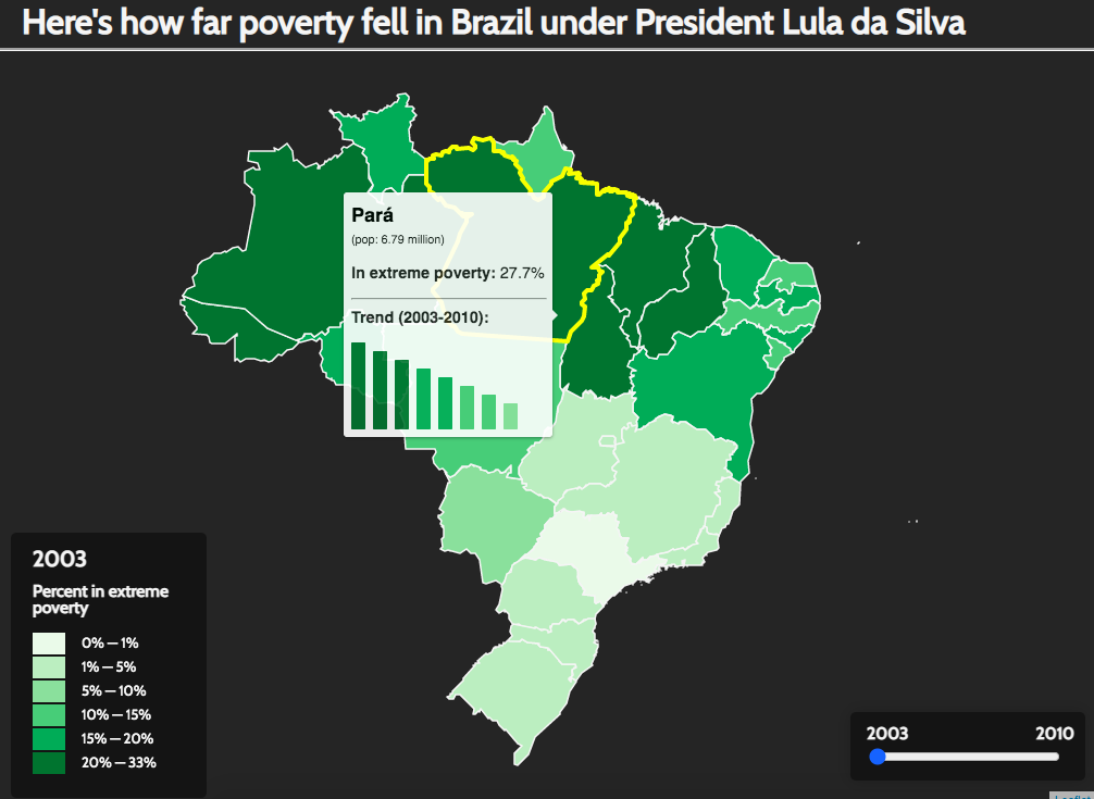
Poverty under Lula
This interactive choropleth map displays the tremendous drop in extreme poverty levels in Brazil from 2003-2010. See for yourself!
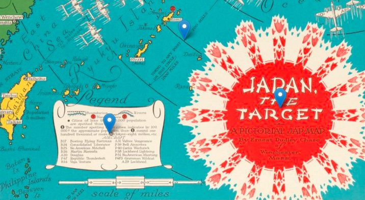
Japan, the Target
Take a closer look at Ernest D Chase's haunting map of wartime Japan with this interactive web story.
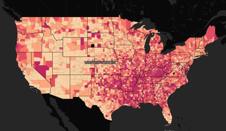
Cancer death rates by US county
This interactive map displays cancer death rates per 100,000 people by US county. While diseases like cancer don't alter themselves according to zipcode, examining their impacts on a county-by-county basis gives us a glimpse into the wildly unequal health outcomes in the United States.
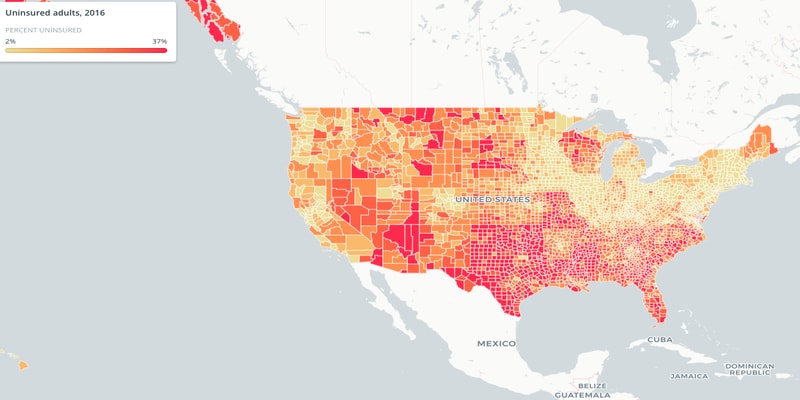
Uninsured adults by US county
The US is unique among wealthy nations in not guaranteeing medical care to its residents. Uninsurance rates are among the more obvious datasets to point to when attempting to demonstrate the widespread lack of access to healthcare in the country. While they don't tell the whole story, they do raise alarm bells.
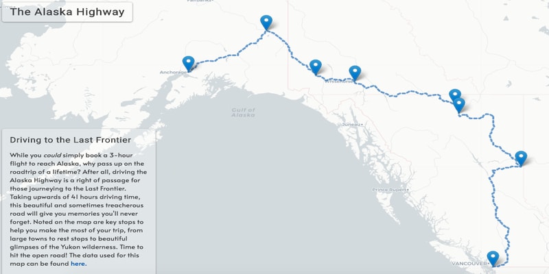
Driving the Alaska Highway
In a change of pace, I created this map while daydreaming about post-pandemic travel. Driving the Alaska Highway is a lifelong dream of mine, and I've mapped out a route with convenient and eye-catching stops along the way.
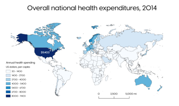
Global healthcare spending
I combined these two maps to make a single point: greater private healthcare spending leads to greater overall costs. Note that the US spends far more on healthcare than the rest of the world, but is unique in that the majority of its spending is private - coming out of consumers' own pockets. Universal public schemes lower costs both for individual residents and the public as a whole.
